
Python in Action: Data Visualization
See how free Python tools can help you reveal insightful trends in raw data
Hey Grokking Python readers!
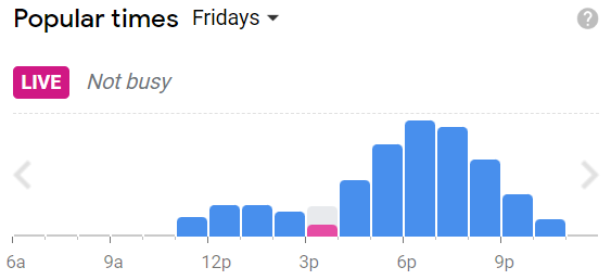
Imagine that you’re visiting a new city and you’re looking for a quiet place to eat dinner. You search for “restaurants” in Google Maps, and you click on one that looks interesting. When you scroll down through the entry for that restaurant, you’ll find a section titled “Popular times,” where visitation rates for different times and days are converted into an easy-to-read bar graph. The graph renders the data more accessible, making it easier for users to make informed decisions about visiting that restaurant.
This is a simple example of data visualization. The data is translated into a bar graph so that users can easily identify patterns and trends. This in turn can lead to actionable insights that can inform their decision making. The Google Maps example shows how an organization can incorporate data visualization into a product to improve the user experience. Organizations also use data visualizations internally. We’re living in the age of big data, after all, and companies are continually working to collect, clean, analyze, and visualize data to inform their business decisions. The sheer volume of data that companies take in creates a need for robust visualization tools that can manage vast and complicated data sets.

There are multiple languages that can support a project involving data visualization. R, JavaScript, and others have some great capabilities, but many programmers consider Python to be the best language for such projects. Below, we’ll discuss the factors you should consider when approaching a data visualization project, and we’ll explore some of the Python tools you can use to get started.
Types of data visualizations
Many types of graphs, diagrams, and tables can be used to represent data visually. Bar graphs, scatterplots, heatmaps, boxplots, and pie charts are just a few that you’ve probably seen before. These images can be static or interactive. Static visualizations represent data in a fixed form that the user can’t interact with. As you might guess, static visualizations are simpler and more common. They display information, but they don’t accommodate or respond to user inputs.
Interactive visualizations allow users to manipulate the image in some way—for instance, by zooming in to view a specific part of the image in greater detail. The Google Maps bar graph above is an example of an interactive visualization. If you navigate from “Fridays” to a different day of the week, the graph will display different data. The Python libraries discussed below accommodate interactivity to varying degrees, so it’s important to consider the user experience when you’re choosing your tools.
Python data visualization libraries
Python has many libraries designed specifically for data visualization. We’ll discuss three of the most popular: Matplotlib, Seaborn, and Bokeh.

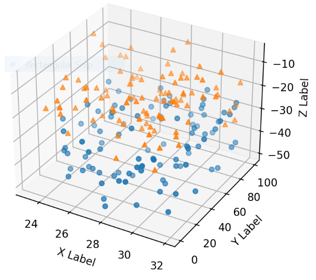
The most basic Python library for data visualization is Matplotlib. It can be used to generate a wide variety of static and interactive charts, including scatterplots, bar graphs, pie charts, boxplots, histograms, power spectra, and stemplots. Here’s an example of a 3D scatterplot in Matplotlib:
Matplotlib can be used in Python scripts, the Python and IPython shells, Jupyter Notebooks, and web application servers, making it a versatile and accessible option for visualizing data in Python. If you find that Matplotlib lacks a feature that you want to use in your project, you can explore the wide range of third-party packages that extend Matplotlib’s capabilities.

Seaborn is another popular data visualization library. It’s actually built on Matplotlib, so the two libraries share some key functionalities. There are some important differences between them, though. Seaborn is generally considered to be more intuitive and user friendly than Matplotlib. It also integrates more smoothly with Pandas data structures, and at least some users find its plots to be more aesthetically pleasing.
Seaborn may improve on Matplotlib in certain respects, but there are good reasons to stick with Matplotlib for specific tasks. It might be a little more unwieldy, but Matplotlib lends itself to more complicated visualization projects. It also has some functionalities that Seaborn doesn’t carry over. Seaborn doesn’t support 3D plotting, for instance, so if a 2D plot isn’t going to do justice to the volume or complexity of your data, you might be better served by Matplotlib.

While Matplotlib and Seaborn are the most popular Python libraries for data visualization, there are others worth knowing, too. Bokeh is one of these (fun fact: is a photography term that refers to the out-of-focus parts of a photograph).
Bokeh is great for making interactive visualizations. The graph below, for instance, allows users to view weather statistics for multiple cities. It also allows users to modulate the style of the graph by switching between smoothed and discrete data points.

The scatterplot below was also made in Bokeh. Note the toolbar in the top right corner of the image. These tools allow users to pan and zoom to different parts of the image.

A number of useful data visualization tools use or are built on Bokeh, including Microscopium, Panel, Chartify, and Mistic.
Matplotlib, Seaborn, and Bokeh are good places to start practicing data visualization in Python, but there are a lot of other tools out there as well. Check out Plotly, Altair, Pygal, and Geoplotlib for a broader view of what Python can offer.
Further learning
As you can probably tell, data visualization in Python is a big topic. It may seem daunting, but fortunately there’s a wide range of resources online that can help you learn more. We’ve collected some of these here.
Is there another Python use-case you’d like us to cover in a future installment of Python in Action? Let us know in the comments or by replying to this email.
As always, happy learning!